Emotion Depends on Context
Color charts that assign one feeling to each hue are tidy and misleading. Mood lives in the relationships between colors, subjects, light and the person looking.
Why the color chart fails
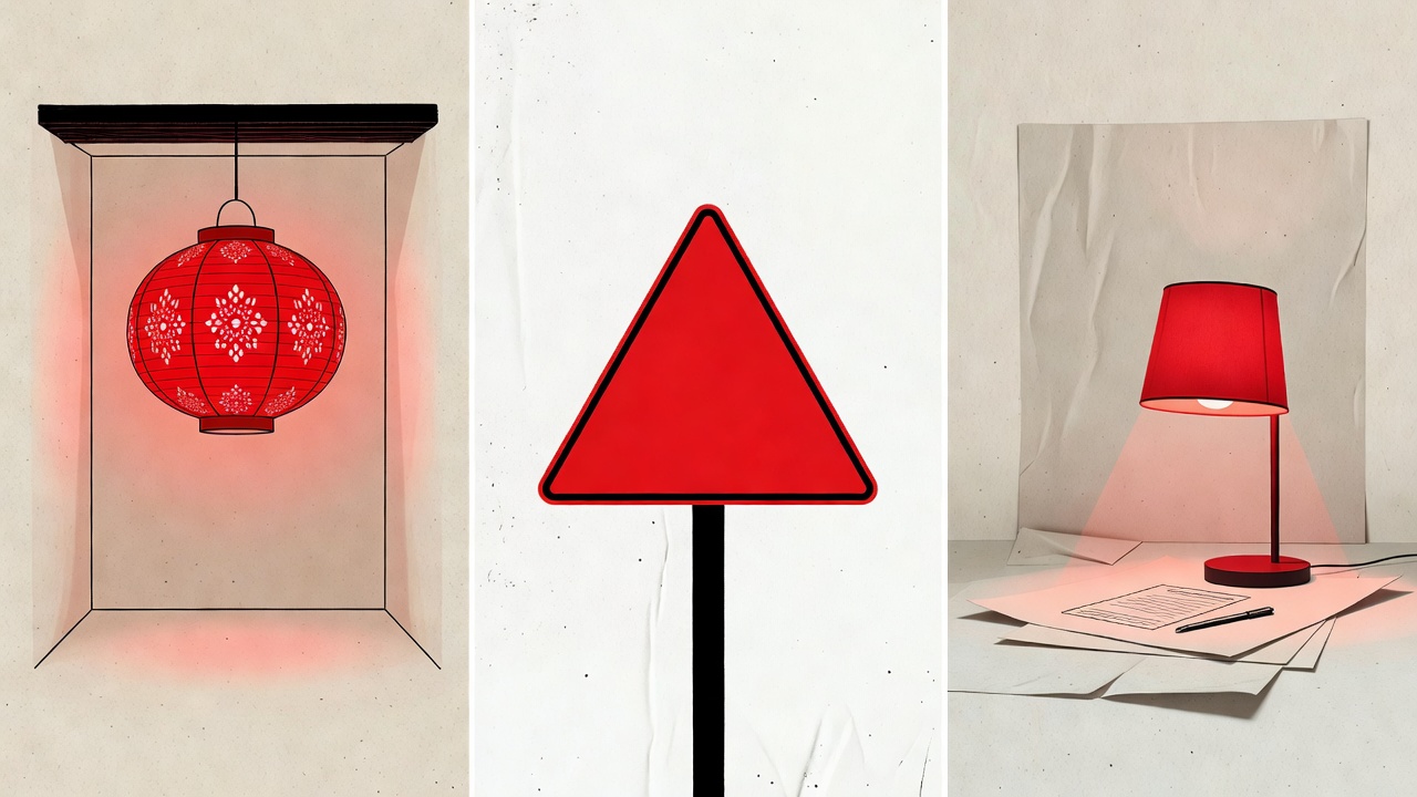
Popular guides often claim that red means passion, yellow means happiness and green means calm. These statements are not wrong so much as incomplete. Red is the color of a wedding dress in many Chinese and Indian traditions, of a stop sign on European roads, of the poppy worn in Britain for remembrance. A single hue can carry joy, danger and grief in the same week, for the same person.
The research is similarly nuanced. Studies on the so-called “red effect” — the suggestion that seeing red influences performance or attraction — produced headline findings in the 2000s, but later replication attempts have returned mixed and often weaker results. The honest conclusion is that context moderates almost every effect, and that a photographer should treat color-emotion links as tendencies to test, not laws to apply.
Three layers of meaning
Established visual effects
High saturation and strong contrast tend to read as energetic; low saturation and compressed value as quiet. These relate to how vision works and travel fairly well across audiences.
Cultural associations
Shared meanings learned through tradition, religion, commerce and media. Powerful within a community, unreliable outside it.
Personal interpretation
A particular green may recall a childhood kitchen. You cannot design for this layer, but you can leave room for it.
The dials that move mood
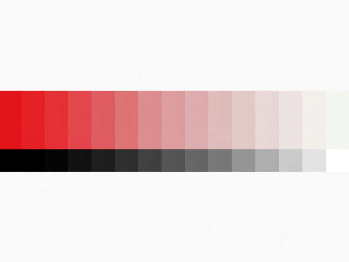
When photographers say an image “feels” a certain way, they are often responding less to hue than to saturation and value. A desaturated, low-contrast palette can suggest memory, fatigue or distance. A saturated, high-contrast one can suggest heat, urgency or celebration. Change the hue while keeping these dials steady and the mood often survives; change the dials and even the same hue shifts register.
This is why the nostalgic quality of Kodachrome or the gentle skin tones of Kodak Portra are hard to reduce to a single color. They are characteristic curves of contrast and saturation as much as they are hues.
Context in film and photography
In Amélie (2001), cinematographer Bruno Delbonnel pushed Paris toward warm reds and greens, creating a world that feels like a fond memory rather than a real city. The emotion comes from the consistency of the palette and the story it frames, not from red or green as such.
Barry Jenkins’s Moonlight (2016), shot by James Laxton, uses saturated, glowing skin tones and vivid night colors to render intimacy and vulnerability. The same hues in a crime thriller might read as menace. The narrative tells us how to feel about the color, and the color amplifies what the narrative already suggests.
Documentary photographers face a particular responsibility here. Grading a refugee camp in cold, desaturated tones may communicate hardship, but it also imposes an emotional reading on real people. Asking whose feeling the palette represents — the photographer’s, the subject’s, or the audience’s expectation — is part of ethical practice.
Write the feeling in words before you choose the color.
If you cannot describe the emotion in a sentence, no palette will find it for you. If you can, the palette becomes a way to keep that sentence honest.
Working with emotional color responsibly
- Know your audience. A palette meant for an international readership should rely more on visual effects than on local symbolism.
- Use the subject as anchor. Let color reinforce what the subject is doing rather than contradict it — unless contradiction is the point.
- Look for unintended readings. Show the image to someone from another background and listen.
- Leave space. Images that over-determine emotion can feel manipulative. A little ambiguity invites the viewer in.
Emotion in color is real, but it is relational. Treat each palette as a proposal to the viewer, one they will complete with their own history.